The Google messaging update looks bad. It reminded me I purchased textra a while ago.
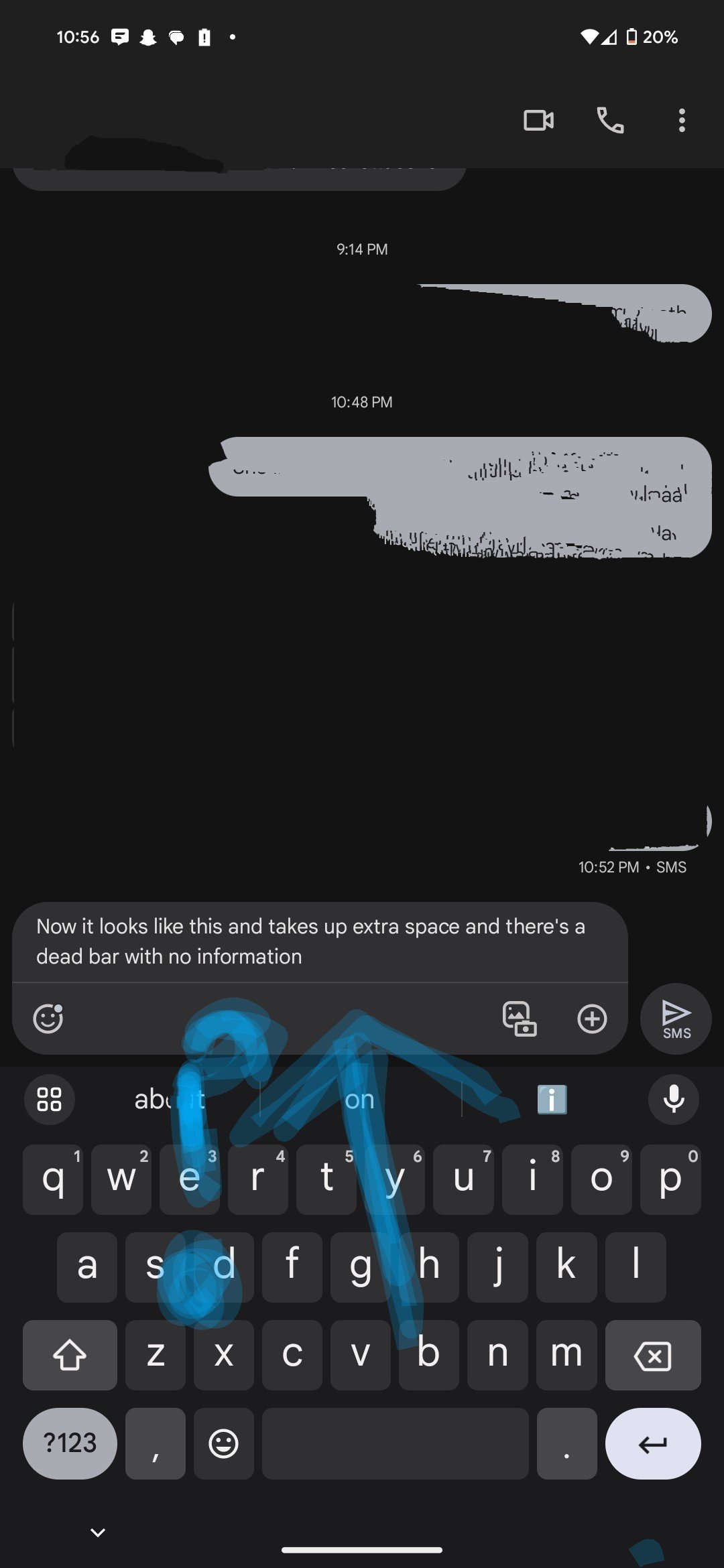
They really didn’t have to redesign a text box. Please stop reinventing the wheel. I don’t need another pop up in my life.
There have been multiple accounts created with the sole purpose of posting advertisement posts or replies containing unsolicited advertising.
Accounts which solely post advertisements, or persistently post them may be terminated.
They really didn’t have to redesign a text box. Please stop reinventing the wheel. I don’t need another pop up in my life.