There have been multiple accounts created with the sole purpose of posting advertisement posts or replies containing unsolicited advertising.

Accounts which solely post advertisements, or persistently post them may be terminated.

GNOME June 2024: C'mon you can do better

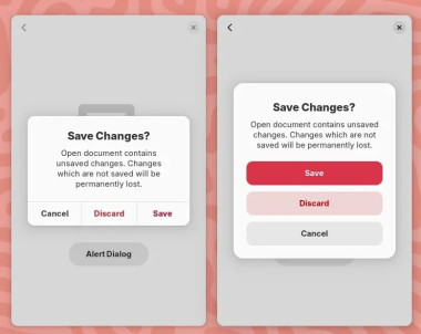
New GNOME dialog on the right:

https://lemmy.world/pictrs/image/8d6ae1b8-566f-4773-80b1-de00c22b782f.jpeg

Apple’s dialog:

https://lemmy.world/pictrs/image/62f4bf9d-b325-4941-98c9-c749445dd823.png

They say GNOME isn’t a copy of macOS but with time it has been getting really close. I don’t think this is a bad thing however they should just admit it and then put some real effort into cloning macOS instead of the crap they’re making right now.

Here’s the thing: Apple’s design you’ll find that they carefully included an extra margin between the “Don’t Save” and “Cancel” buttons. This avoid accidental clicks on the wrong button so that people don’t lose their work when they just want to click “Cancel”.

So much for the GNOME, vision and their expert usability team :P
sedot ,

They should simply find the courage to implement Apples Human Interface Guidelines. It wont hurt and they are almost there anyway.

TCB13 OP ,
@TCB13@lemmy.world avatar

That’s my point. :)

However for this they would need to admit to themselves that they’re essentially a copy of macOS.

sedot ,

I totally agree - Apple invested alot of cash and time into this, just take it and make it better here and there. Just a few steps left :)

TCB13 OP ,
@TCB13@lemmy.world avatar

just take it and make it better here and there. Just a few steps left :)

You mean, copy it and make it open :P I guess something along the lines of github.com/CuarzoSoftware/Louvre

@ehopperdietzel is working on that it seems.

sedot ,

Thank you, bookmarked. Never heard of this yet. :)

kenkenken ,
@kenkenken@sh.itjust.works avatar

At least it is not a cheap copy of Windows.

TCB13 OP ,
@TCB13@lemmy.world avatar

Ahaha fair enough. * screams in KDE *

ShittyBeatlesFCPres ,

I don’t use KDE as my daily driver but it’s on my SteamDeck and I haven’t once been trying to change a setting or something and encountered a window that looks like Windows XP because no one at a whole multi-trillion dollar company could be bothered to update it. It’s way better than Windows 11.

Ephera ,

Excuse me, Windows is the cheap copy of KDE.

possiblylinux127 ,

No you got it all wrong KDE is just a Windows 11 copycat. Microsoft is full of original ideas.

Hjalamanger ,
@Hjalamanger@feddit.nu avatar

I find that “carefully included extra margin” outrageously ugly

GolfNovemberUniform ,
@GolfNovemberUniform@lemmy.ml avatar

Same

Deckweiss ,

It’s ugly, but useful.

(unlike me, I am ugly and useless /s)

jeremias ,
@jeremias@social.jears.at avatar

I have no idea about apple design guidelines and am not a UX designer, but wouldn’t a horizontal seperator look better? In gtk i would add one here, gives some extra space and more visual seperation.

Dremor ,
@Dremor@lemmy.world avatar

Looks alright to me.

TCB13 OP ,
@TCB13@lemmy.world avatar

I don’t completely disagree with you, however the cost of losing an important document because you clicked on the wrong thing is way higher than having to look at the extra space every day.

GolfNovemberUniform ,
@GolfNovemberUniform@lemmy.ml avatar

Both designs are good imo. Adding the extra space for the “cancel” button could cause a copyright claim so I think that’s a viable reason why it’s absent in GNOME. And I don’t see anything wrong in copying Apple design. They can do what they want and the new design is very nice in terms of ease of understanding and accessibility potentials. GNOME’s workflow is similar to Apple’s so why not copy some more things for better consistency?

TCB13 OP ,
@TCB13@lemmy.world avatar

Both designs are good imo. Adding the extra space for the “cancel” button could cause a copyright claim

What ahaha since when a modal is copyrighted? I don’t buy it, this is simply poor design by the GNOME team.

GNOME’s workflow is similar to Apple’s so why not copy some more things for better consistency?

Exactly my point, but they should learn how to properly copy things. Or at least think about them, Apple didn’t add the margin for no reason.

GolfNovemberUniform ,
@GolfNovemberUniform@lemmy.ml avatar

I get it that you hate this design and its obvious strong inspiration by Apple but accusing GNOME team in being lazy is too much. They created the most popular and one of the most stable DEs on Linux and their own workflow that’s similar to Apple’s but still is unique. Also when I saw that new design, I was amazed. To me it looks really great. It’s going to be a good update with accent color support (I won’t fight about it ok?) for sure. It’s just a matter of preference. Both designs are good enough technically imo.

TCB13 OP ,
@TCB13@lemmy.world avatar

I get it that you hate this design

I don’t hate it, it looks better than what was there before, no doubts there, but at the same time they could’ve just made it better.

All the literature on action buttons with dangerous effects tells you to add margins, accents and shades. Any design undergraduate should be aware of this, however the GNOME team totally missed it.

It’s going to be a good update with accent color support (I won’t fight about it ok?)

It’s funny that you mention that because…

In macOS, you can specify an accent color to customize the appearance of your app’s buttons, selection highlighting, and sidebar glyphs. The system applies your accent color when the current value in General > Accent color preferences is multicolor. support.apple.com/en-mt/guide/mac-help/…/mac

I’m totally okay with “being inspired” (cloning) macOS, it should be viewed as good thing because Apple does spend a lot in UX research however lets make thing properly.

GolfNovemberUniform ,
@GolfNovemberUniform@lemmy.ml avatar

I don’t hate it, it looks better than what was there before, no doubts there, but at the same time they could’ve just made it better.

How? Improving something like this is hard. Do you have any proposals?

All the literature on action buttons with dangerous effects tells you to add margins, accents and shades. Any design undergraduate should be aware of this, however the GNOME team totally missed it.

I’m afraid to tell you that in 2024 nobody cares about that. “Shape following feeling” in MD is the best example I can think of. Now aesthetics is preferred to make people buy (or use for free in this case) the product. People are not tech savvy. They want good looks and GNOME nailed it imo. It’s stunning. They even got me but I do care about aesthetics unfortunately. I’m a spoilt mass consumer. Eject me if you will.

accent color

Accent color taboo. Let’s not talk about accent color.

TCB13 OP ,
@TCB13@lemmy.world avatar

How? Improving something like this is hard. Do you have any proposals?

I’ve submitted a fair share of UX in-depth analysis with examples and links to literature on the GNOME team blog and they tend to ignore / comment dismissingly and then remove my comments after a few weeks.

Accent color taboo. Let’s not talk about accent color.

Ahahaha

GolfNovemberUniform ,
@GolfNovemberUniform@lemmy.ml avatar

Judging from your post and replies, you look very aggressive, rude and demanding so no wonder the devs deleted your comments.

TCB13 OP ,
@TCB13@lemmy.world avatar

In-depth analysis ≠ random ramblings on lemmy.

bitfucker ,

To be fair, he could also just be fed up after a long time being ignored for what he thinks is quite an important design decision.

GolfNovemberUniform ,
@GolfNovemberUniform@lemmy.ml avatar

May be but some of this user’s post history is a bit questionable.

Shareni ,

the most popular

Citation very much needed

one of the most stable DEs on Linux

Hardly, but I’m guessing you’re thinking of reliability instead. Not really surprising when it’s so stripped down that vanilla GNOME is pretty much unusable. When you extend it, in order to get a proper DE, that goes right out the window.

That fact makes it especially funny that vanilla GNOME is by far the fattest DE around. How it manages to use up more resources than KDE is beyond me.

GolfNovemberUniform ,
@GolfNovemberUniform@lemmy.ml avatar

Citation very much needed

Ubuntu, RHEL and Fedora use it as the default and they are very big distros. Idk if it’s enough but that’s what I know.

Hardly, but I’m guessing you’re thinking of reliability instead.

Idk. KDE was unstable for me and it always has bugs after major releases. They should test things better.

Not really surprising when it’s so stripped down that vanilla GNOME is pretty much unusable.

Personal opinion.

That fact makes it especially funny that vanilla GNOME is by far the fattest DE around.

Deepin.

How it manages to use up more resources than KDE is beyond me.

You have a point here. Qt is better in terms of efficiency afaik and performance is extremely important for an OS component. But hey at least it’s getting better over time.

Shareni ,

Ubuntu, RHEL and Fedora use it as the default and they are very big distros. Idk if it’s enough but that’s what I know.

I mean, that’s pretty irrelevant. If you were for example at least comparing the downloads of fedora Vs spins, that would be a beginning of something.

Idk. KDE was unstable for me and it always has bugs after major releases. They should test things better.

  1. In case it wasn’t obvious: stability is not reliability
  2. So does GNOME, especially when you have a lot of extensions
  3. KDE is pretty crap in both regards

Personal opinion.

Is that why every distro comes with vanilla GNOME? Oh wait…

But hey at least it’s getting better over time.

Meanwhile over the years KDE got lighter than GNOME while constantly piling on features.

GolfNovemberUniform ,
@GolfNovemberUniform@lemmy.ml avatar

This is turning into a meaningless argument now. I don’t want to continue.

MrAlagos ,

How it manages to use up more resources than KDE is beyond me.

It can happen when you have to develop all your technology on your own instead of relying on the work of a hundred-million dollar company that does the heavy lifting for you.

possiblylinux127 ,

We shouldn’t design desktops to avoid copyright claims. Desktops should just create original designs that make sense for the goals of the desktop. We don’t need to make changes based on Windows 11 or Mac OS. They aren’t separate entirely and irrelevant.

GolfNovemberUniform ,
@GolfNovemberUniform@lemmy.ml avatar

Do you mean that any copying is bad or any copying is ok as long as it helps achieve the goals?

possiblylinux127 ,

When you copy the outcome is almost always going to be worse than the original. Do your own thing and be the person or project you want to be. You don’t need to care outside of the project.

GolfNovemberUniform ,
@GolfNovemberUniform@lemmy.ml avatar

This. But 99% of the internet will hate your project for absolutely anything they don’t like in it and it will kill the project because distros won’t want to use it.

Chef6652 ,

I hope they continue learning lessons from other OSes.

I’m feeling like you are wrong about them outright copying. Some good things can be taken from macOS and Windows. But a lot of bad things too, which is why they are thinking it through.

Please do not reduce the community effort to “cloning macOS”. It’s insulting to the people working on it… Apple doesn’t own modals or modal design.

Here there are not 20 ways of putting 3 buttons in a modal. They just happen to choose a way that will also work on mobile I guess.

Kudos for noticing this extra space which could enhance these kind of modals though.

I don’t like everything Gnome has been doing, especially with the lack of customization or the status bar. But Gnome has been my go to for 7+ years and I like where it is going. Extensions are pretty fly too 👌

TCB13 OP ,
@TCB13@lemmy.world avatar

Please do not reduce the community effort to “cloning macOS”. It’s insulting to the people working on it…

Well, it’s insulting for people to lose their work because someone did a lousy UX job. :)

Cloning macOS should not be views as something “bad” because for what’s worth we all know Apple spends a LOT in usability research (they’re not as good as they used to be, but still better than the rest).

Kudos for noticing this extra space which could enhance these kind of modals though.

That’s the thing, I’ve basic design / UX training and all the literature on action buttons with dangerous effects tells you to add a margin. Any design undergraduate should also be able to notice that life saver as well… however the GNOME team totally missed it.

This isn’t the first time them failing at basic UX and they don’t like when people try to suggest improvements nor when they later on criticize them.

KindaABigDyl ,
@KindaABigDyl@programming.dev avatar

Having used OS X, there is no way they’ve done usability testing. Doing basically everything is hard on OS X

gianni ,
@gianni@lemmy.ca avatar

This is an insane take based on absolutely nothing.

GravitySpoiled ,

Just because you like apple doens’t mean that apple does a perfect job and GNOME should copy it. GNOME does a lot of thing better than apple. And microsoft also does a couple of things better than apple. Apple isn’t perfect and microsoft isn’t all bad

TCB13 OP ,
@TCB13@lemmy.world avatar

Just because you like apple doens’t mean that apple does a perfect job and GNOME should copy it. GNOME does a lot of thing better than apple.

Yes, so let’s copy Apple and keep the few things GNOME does well.

Routhinator ,
@Routhinator@startrek.website avatar

Sometimes when you get UI experts and users and engineers in the same room they iterate to similar outcomes because its the logical conclusion. Apples design in this case isn’t ground breaking or even original.

If multiple species of jumping spider can independently evolve the ability to see red from different branches of their family tree, multiple dev teams can come to the same conclusion about what is more comfortable for reaching with consideration for left and right handed people on various types of screens.

The problem is so scoped these days, its fairly logical for UIs to come to the same outcome.

  • All
  • Subscribed
  • Moderated
  • Favorites
  • [email protected]
  • random
  • lifeLocal
  • goranko
  • All magazines