There have been multiple accounts created with the sole purpose of posting advertisement posts or replies containing unsolicited advertising.

Accounts which solely post advertisements, or persistently post them may be terminated.

mrGarbanzo ,

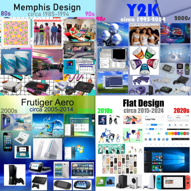
I love the excess of the Y2K Era. Everything was so much more beautiful, unique, and strange. Everything after seemed like an attempt to “dial it back.”

krimsonbun ,
@krimsonbun@lemmy.blahaj.zone avatar

memphis & flat

Appoxo ,
@Appoxo@lemmy.dbzer0.com avatar

Was the 3DS (main menu) really frutiger? Feels like a far cry compared to Win7 and the xbox 360

Stovetop ,

It doesn’t have quite as much “gloss”, but what puts it in that era for me is the beveled and 3d elements that disqualify it from being “flat”. Some of its design elements were also semi-skeuomorphic.

https://www.nintendoworldreport.com/media/22792/1/3.jpg

kratoz29 ,

The Nintendo Switch theme is the most boring shit I have ever seen in a recent handheld… At least it can be improved if you have it hacked… But 3DS were much better, anytime I open it up and the Phoenix Wright or Hotel Dusk BGM start to hit is the real deal!

JayDee ,

Peak design was late 90s and 2000s, where you got to see the new crazy designs of a new era while 80s design still existed all around you prevalently. That fusion is peak nostalgia for me.

menemen ,

Y2k was a really exiting phase, but my nostalgia lives for the late 80s and early 90s. But who is the asshole who did neither include a C64, not an Amiga in this?

Vub ,

Probably someone outside of Europe, that was Commodores main market. Especially the Amiga generation.

caseyweederman ,

Right?? And the MSX too.

mub ,

The music. The early 90s saw the rise of independent record labels which then gave rise to bands who wouldn’t have stood a chance otherwise, aka Indie Music. After the 60s, the 90s is by far the best era for modern music ever.

bennieandthez ,
@bennieandthez@lemmygrad.ml avatar

I like flat hardware (the ps5 shouldnt be there tho). You can stack stuff over flat hardware, they’re not akward to place, can be easily stored, easier to design, easier to machine, etc…

Now flat software is fucking mediocre and should be abolished,

PrimeMinisterKeyes , (edited )

Strange, just for the last few days, I’ve been thinking just what a big cultural turning point 2005 seemed to be. From then on, everything started to circle the drain, and I put the blame on globalization and the advent of large-scale social media. Which might have left an imprint on product design and fashion.
And, as I wrote earlier in a different thread, the shift from 1994 to 1995 was the biggest one I’ve witnessed, and it was very visible in public spaces. Audible as well: It went from Metallica and ZZ Top as supermarket background music (imagine this!) to “Easy Listening” or whatever.

VinesNFluff ,
@VinesNFluff@pawb.social avatar

Deleted my previous comment, felt like I should give this a bit more attention.

To be honest I feel like all designs are good in their own way. I like the general vibe of Memphis, but being that I was born in the mid 90s, it’s probably just that general energy you get from things that happened before you did, where they are “cool” due to how just-old-enough-to-be-old-but-not-old-enough-to-be-an-antique they are, yanno?

Y2K design – Well. I like the transluscent plastic on Gameboys and Macs. Really underrated aesthetic, wouldn’t mind having it back. The DreamCast had some very sleek angles too.

Frutiger Aero will never not “look like the future” to me. It was the age of computer interfaces having all sorts of fun colours and transparencies and animations, and it just LOOKED futuristic and neat. Don’t care for the product designs of the era though. That shiny finish would draw in filth and fingerprints from accross the room and after a very short time it’d lose its prettiness.

Flat design I have issues with, like the hamburger menus and the abandonment of descriptive text in favour of abstract icons – It is also a bit too serious, but I understand and accept that, even if I miss the playfulness of Frutiger. – But it DID finally bring us dark mode. And my eyes are forever grateful.

… Just wish solarized themes were the norm instead, no idea why they must have such high contrast. I’d even give light mode its time of day if it was a solarized light instead.

captainlezbian ,

Yeah I like the first three for the reasons you gave though flat design’s main issue for me is that it feels empty and corporate but like it thinks it isn’t or it’s trying to hide it. It’s the design opposite of the long form ad. The other designs here had a message and feeling, and yes it was always “futuristic” but this one isn’t. It’s simple without purpose, animated without life, and artistic without message. It’s the art style equivalent of my landlord asking for a quote about “the unique culture and experience of [complex]”.

Compare it to art deco which calls on you to acknowledge the grandiosity of the time. Honestly it could use a modern reinterpretation and revision of something like soviet realism to challenge it.

ICastFist ,
@ICastFist@programming.dev avatar

You know the worst part about flat design? Fucking “hamburger menu”. Fuck that shit.

The second worst part? “Text? Lol get real, old man!” Menus that don’t have text so I have to guess what the fucking icons mean on every different app/site.

DumbAceDragon ,
@DumbAceDragon@sh.itjust.works avatar

Fontawesome and its consequences have been a disaster for web development.

Appoxo ,
@Appoxo@lemmy.dbzer0.com avatar

I prefer the hamburger menu way more.
But what I really prefer on desktop is the ribbon menu that MS uses in their office suite.

wols ,

Ditto on the no text part. That is an accessibility failure that’s way too widespread.
Sometimes I’m afraid to even push a button: does this delete my thing, or does it do some other irreversible change? Will I be able to tell what it did? Maybe it does something completely different, or maybe I’m lucky and it does in fact perform the action I’m looking for and which in my mind is a no-brainer to include?

And it’s infected interpersonal communication too - people peppering their messages with emojis, even professional communications. It not only looks goofy, but is either redundant (when people just add the emoji together with the word it’s meant to represent - such a bizarre practice) or, worse, ambiguous when the pictogram replaces the word and the recipient(s) can’t make out what it depicts.
The most fun is when it’s a mix - the message contains some emojis with accompanying translation, some without.

ZeffSyde ,

This might as well ask, “When were you young and broke and wanted everything you saw in a commercial and then started collecting ridiculous amounts of nostalgia product as soon as you had even a crumb of disposable income.”

Thankfully I didn’t fall for that nonsense.

: reclines on throne made entirely of first gen Zunes and Sidekick phones:

SuperSpruce ,

The next generation of design is already taking shape. It’s a simplistic skewmorphic design, where it looks like the logo has been made out of clay. Look at the new Reddit and Android logo.

josephsh5 ,

So basically IOS’s design language prior to IOS 7

trslim ,

Aero is my favorite. I think it looks nice

wols ,

I don’t share the hate for flat design.
It’s cleaner than the others, simpler and less distracting. Easier on the eyes, too. It takes itself seriously and does so successfully imo (nice try, aero). It feels professional in a way all the previous eras don’t - they seem almost child-like by comparison.

Modern design cultivates recognizable interactions by following conventions and common design language instead of goofy icons and high contrast colors. To me, modern software interfaces look like tools; the further you go back in time, the more they look like toys.

Old designs can be charming if executed well and in the right context. But I’m glad most things don’t look like they did 30 years ago.

I’m guessing many people associate older designs with the era they belonged to and the internet culture at the time. Perhaps rosy memories of younger days. Contrasting that with the overbearing corporate atmosphere of today and a general sense of a lack of authenticity in digital spaces everywhere, it’s not unreasonable to see flat design as sterile and soulless. But to me it just looks sleek and efficient.
I used to spend hours trying to customize UIs to my liking, nowadays pretty much everything just looks good out of the box.

The one major gripe I have is with the tendency of modern designs to hide interactions behind deeply nested menu hopping. That one feels like an over-correction from the excessively cluttered menus of the past.
That and the fact that there’s way too many “settings” sections and you can never figure out which one has the thing you’re looking for.

P S. The picture did flat design dirty by putting it on white background - we’re living in the era of dark mode!

  • All
  • Subscribed
  • Moderated
  • Favorites
  • [email protected]
  • random
  • lifeLocal
  • goranko
  • All magazines