There have been multiple accounts created with the sole purpose of posting advertisement posts or replies containing unsolicited advertising.

Accounts which solely post advertisements, or persistently post them may be terminated.

Searching for exact app names in the Play Store

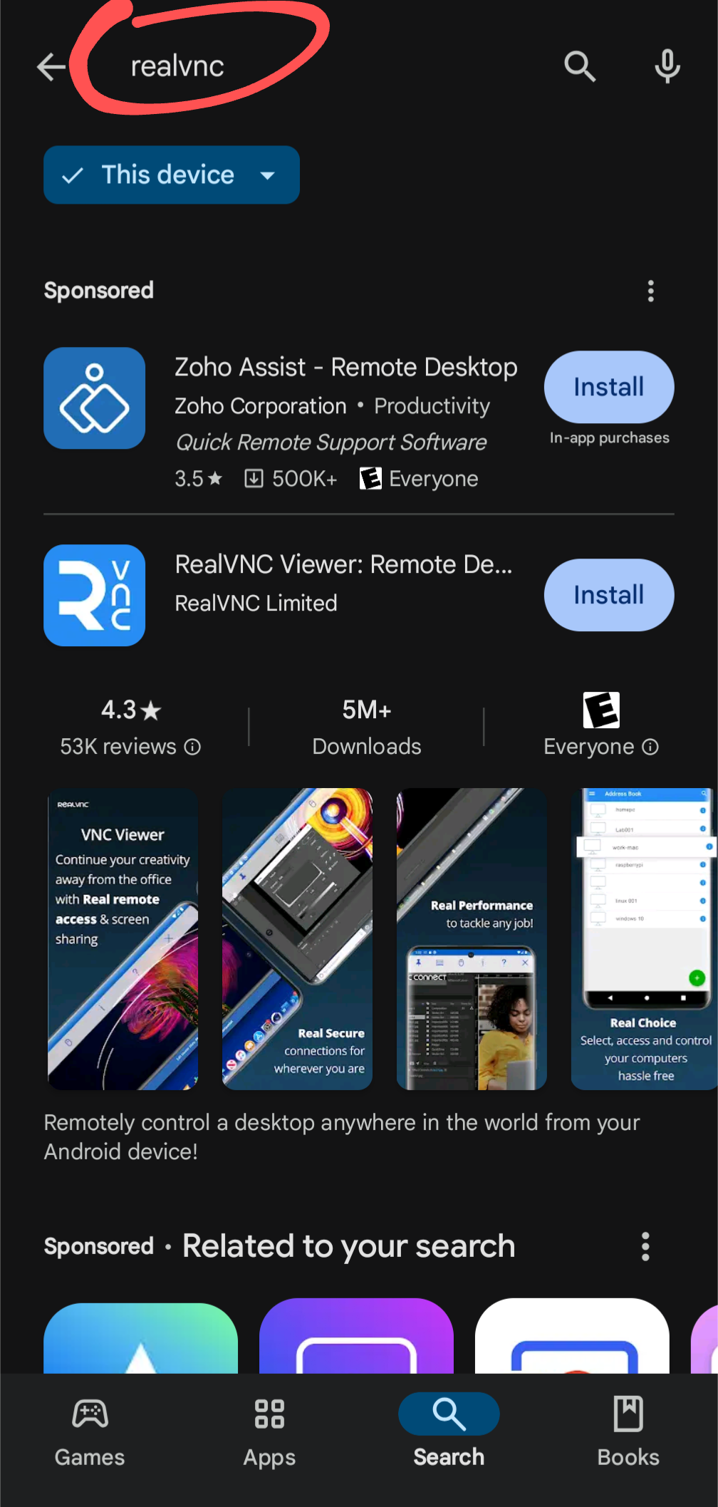
I asked a relative to look for RealVNC on the Play Store and install it. Once they were done, I asked them to fulfill a basic task inside RealVNC and they were really confused by my instructions. I took a look at their phone, lo and behold, they had installed a different app. I asked them to repeat the install procedure while I watched. They punched in “realvnc” in the search box, two identically formatted results appeared. Their finger instinctively clicked the Install button on the top result. It was an ad. 🤦‍♂️🤦‍♀️🤦

a screenshot of a search for realvnc on the Google Play Store, showing an ad above the real result
Ilandar ,

This seems like a case of user error, considering the sponsored result is clearly not the application you asked them to install. However, the Play Store is undoubtedly trash and anti-consumer which is why I primarily use the Aurora Store even on non-deGoogled phones. Performing the same search in Aurora, that Zoho Assist app is not even in the first 20 results while RealVNC Viewer and RealVNC Server are the top two results.

avidamoeba OP , (edited )
@avidamoeba@lemmy.ca avatar

Of course it’s user error. However a system makes it easier or harder to achieve a task or make errors. You say it’s clearly not the app that was asked for. I see two equally sized icons of nearly identical color, two equally sized Install buttons if the same color. The first one being the wrong one. And this is after looking for an exact app name. I think we don’t need a focus group to show this drives clicks away from the searched app and to the ad. In fact we can be reasonably sure Google’s research drove the decision to create this UX. In a slightly saner timeline I’d have expected the ad to not have an Install button on it or at the very least to not use the prominent button color. 😒 BTW I didn’t downvote.

Ilandar ,

Of course, as I said - the Play Store is trash and anti-consumer. However, that does not change the fact that the sponsored application is clearly not called “RealVNC”, nor does it have a logo which says or suggests it is RealVNC. If you are getting tricked by the colour of an application logo then you have problems closer to home you should be worrying about.

snooggums , (edited )
@snooggums@midwest.social avatar

No, fuck that. The ads being listed before rhe first result are intended to cause people to misclick. That isn’t all on the user.

Don’t excuse predatory business practices.

Ilandar ,

Are you illiterate? My very next sentence was:

However, the Play Store is undoubtedly trash and anti-consumer which is why I primarily use the Aurora Store even on non-deGoogled phones.

snooggums ,
@snooggums@midwest.social avatar

If the practices are predatory, blaming the user is excusing the predatory practices. Bragging about how you use something else in that context is doubling down on blaming the user instead of the practices.

So no, I am not illiterate. You ahould have just left off the sentence blaming the victim.

Zorque ,

is doubling down on blaming the user instead of the practices

They blamed both, though.

snooggums ,
@snooggums@midwest.social avatar

Blaming a user for falling for malicious practices designed by multibillion dollars companies is like blaming the victim of a hit and run. “It was their fault for using the crosswalk, but the driver was also wrong for not stopping.”

Both sides!

Zorque ,

Yeah, no one should have to look at what they’re doing to stop themselves from making mistakes! Everyone should be able to blindly make decisions and they should always be correct!

snooggums ,
@snooggums@midwest.social avatar

Victims just bring it on themselves!

Ilandar ,

However, the Play Store is undoubtedly trash and anti-consumer

Trainguyrom ,

Clearly many of the commenters here have not supported average smartphone users enough to know how they will blindly click the first thing that looks anything like what they think the technician is asking them to click. Remember, the average person does not have a laptop or desktop computer, they only have a phone (and only the one because they probably traded their old phone in with the carrier for a pittance when they got their current one), and they often do not have internet service at home and simply rely on mobile data from their unlimited data plan.

avidamoeba OP ,
@avidamoeba@lemmy.ca avatar

This was the thought process I had after the episode. I pictured the average user, blissfully installing apps they didn’t search for, before trying again and installing what they needed. I bet a lot of those people leave such apps installed after the fact. And I don’t recall the current broadcast behavior but some time ago it was possible to wake up without the user starting the app and then you could do work on the user’s device. Such as pestering then with notifications, sucking up data, and so on.

toynbee ,

Is that really the average user? Especially not having internet service at home? I can reluctantly but relatively easily believe the “no computer” bit but, average or not, I don’t think I know anyone without some kind of non-mobile Internet.

viking ,
@viking@infosec.pub avatar

Nobody in my wife’s family has a laptop. Not a single person. They are tech illiterate to the point where I’m not sure they know how to use a keyboard.

That’s probably not the average user either, but they certainly help to set the average as low as it truly is…

toynbee ,

It’s entirely plausible that this is the case for your wife’s family and others, but it’s hard for me to imagine a household without at least one non mobile computer. However, I can.

Without non mobile internet, though? Again, I can imagine it … But it seems wrong.

It shouldn’t be so hard; I was around before the internet was prevalent. My life now involves constant internet access, though, so I guess it’s weird to me that some people have lives that don’t - and especially that that might be the average.

One must always remember the words of George Carlin, I suppose.

helenslunch ,
@helenslunch@feddit.nl avatar

two identically formatted results appeared

Uhhhh no they didn’t. I mean unless you mean “identically formatted” the way every app in the Play Store is.

One is an advertisement, and labeled as such.

avidamoeba OP , (edited )
@avidamoeba@lemmy.ca avatar

Now squint just a bit. That’s how everyone without perfect vision sees it, and that’s a huge proportion of people.

Also, this is how other results appear:

https://lemmy.ca/pictrs/image/f46d9694-d633-4b3c-9e6d-844e0ee97040.png

No Install buttons.

E: Not sure why this image doesn’t show but in any case, app results in lists don’t have Install buttons. Hm apparently it only doesn’t show on mobile.

helenslunch ,
@helenslunch@feddit.nl avatar

I don’t doubt lots of people make that mistake, but ya can’t fix stupid. The only thing they can do is remove the ads entirely, which they probably should, but definitely won’t, but that is a different conversation.

avidamoeba OP ,
@avidamoeba@lemmy.ca avatar

Removing the Install button from the ad would eliminate this issue in most cases. There, I fixed stupid. I’ve done UX btw, some of it on Android.

helenslunch ,
@helenslunch@feddit.nl avatar

You haven’t fixed anything, you’ve just made it more difficult to install the advertised app.

avidamoeba OP ,
@avidamoeba@lemmy.ca avatar

I aimed to make it more difficult to install the advertised app by accident, which was the original problem. You seem to agree that my design change would achieve that. 😂

helenslunch ,
@helenslunch@feddit.nl avatar

My point is there is no way they can make it any more clear without making the advertised app harder to install, which is counter-productive. If your concern is that having advertised apps at the top of the search results makes people more likely to click on them, yes, everyone knows, and that is the intent.

Tell your relative to pay more attention to what they’re installing. That’s the only solution here.

avidamoeba OP , (edited )
@avidamoeba@lemmy.ca avatar

Everyone here knows everything you said. I’m merely providing a current example of where things are today and I’m making a moral judgement that this design has become too counterproductive for the user. Not sure if you stand on the other side of this and if you do, that’s fine. You may have your reasons to support Alphabet’s corporate interest. I don’t in this case. Therefore I feel it’s justified to make things less productive for Alphabet. You suggested nothing can be done other than removing the ad altogether. I suggested a way to solve the issue I highlighted without removing the ad.

helenslunch ,
@helenslunch@feddit.nl avatar

I understand your concern. I absolutely don’t support alphabet LOL. I don’t even use the Play Store. I just don’t think they can shoulder 100% of the blame here and I think your description of “two identically formatted results” is disingenuous. The two apps do not share a name or a description. The closest thing is that they have a similarly-colored icon.

avidamoeba OP ,
@avidamoeba@lemmy.ca avatar

Assume it’s not disingenuous. Instead picture observing a user confusing the two and draw a conclusion other than they’re an idiot. But you already said you understand this design makes users more likely to click on the ad. Do I have to explain the common elements of the layouts in a wireframe? Do I have to go into the differences in noticeability between more and less prominent design language elements in order to explain in what way they’re identical? Come on, cut some slack and assume better.

evo ,

The screenshot you are showing is scrolled down the page past “More results”. What you are showing is after all of the actual search results (which for me is just the app and no ad).

Ephera ,

As someone who’s seeing this Play Store search result page for the first time, I also find it massively confusing.

Frankly, it looks like just the description page of RealVNC with an info box for “Zoho Assist” at the top (which might be the team that develops RealVNC?), and for some reason there’s also two install-buttons.

You don’t have a chance to realize that it’s a list of search results, because there’s practically no repeating UI elements.

Aside from the sponsored app at the top (which I also don’t find clearly labeled; that “Sponsored” could just be a generic heading above everything), I don’t even assume malicious intent from Google here.
Presumably, they made the RealVNC entry big, because they don’t want you falling for scam apps. But it is absolutely not helpful in this case.

JoMomma ,

Must have something to do with the setting on my phone, I have seen what you are showing before

https://lemm.ee/pictrs/image/70448073-a9ff-4d30-9249-5b5e0867a5e9.png

avidamoeba OP ,
@avidamoeba@lemmy.ca avatar

Oh this looks closer to what I recall seeing some time ago. I don’t visit the Play Store frequently. It could be regional, or user group difference, or perhaps just older/newer version.

Etterra ,

They recently changed it so that the search bar no longer appears by default, and you have to go to the search tab just to get to it. Fuck heads.

Chozo ,

Not to say that your relative is at fault, but this might also be a good opportunity to teach them about the font scaling and other visual accessibility settings in Android.

  • All
  • Subscribed
  • Moderated
  • Favorites
  • [email protected]
  • random
  • lifeLocal
  • goranko
  • All magazines